Visualizing Bloodtests:
We were happy to win a design competition in Wired US this month.
It was around re-envisioning medical data. Specifically, blood test results. Which suck, design-wise. They still look like secret missives from the CIA circa 1965. Yet their contents are vitally – perhaps mortally – important.
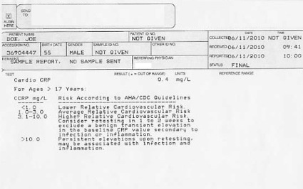
Our challenge was to approach a cholesterol level test. First it looked like this.
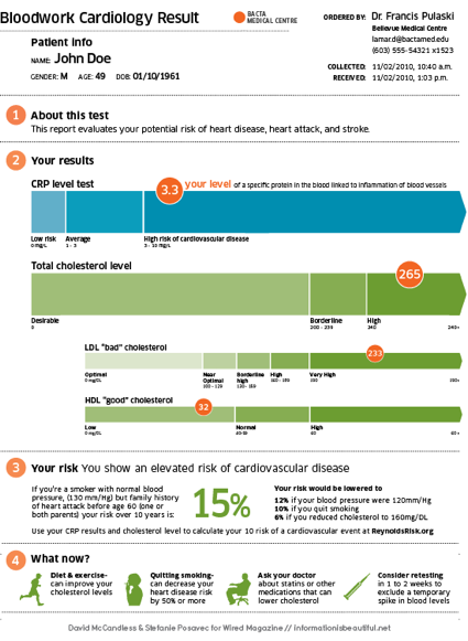
Then we designed it thus:
No comments:
Post a Comment